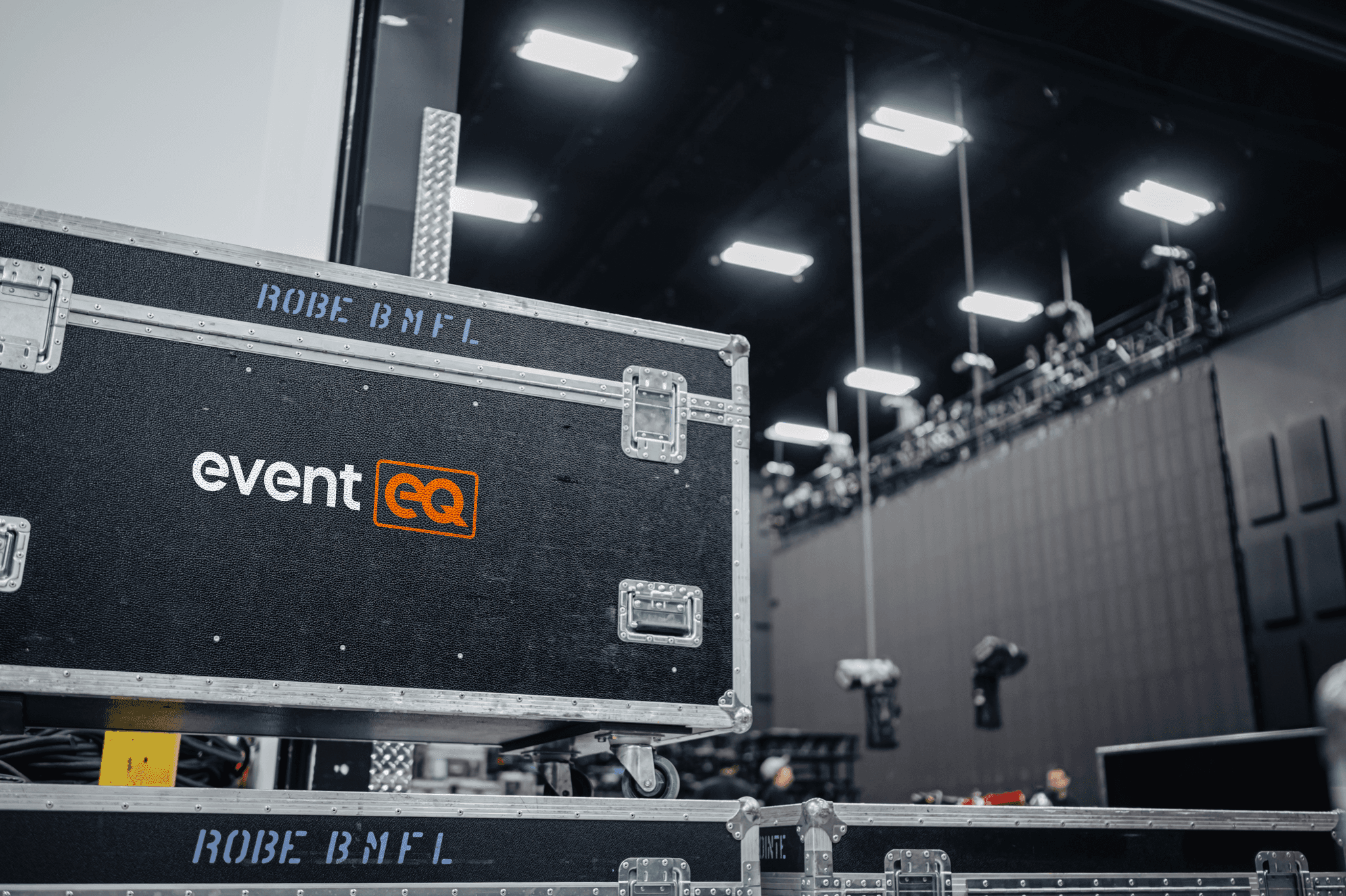
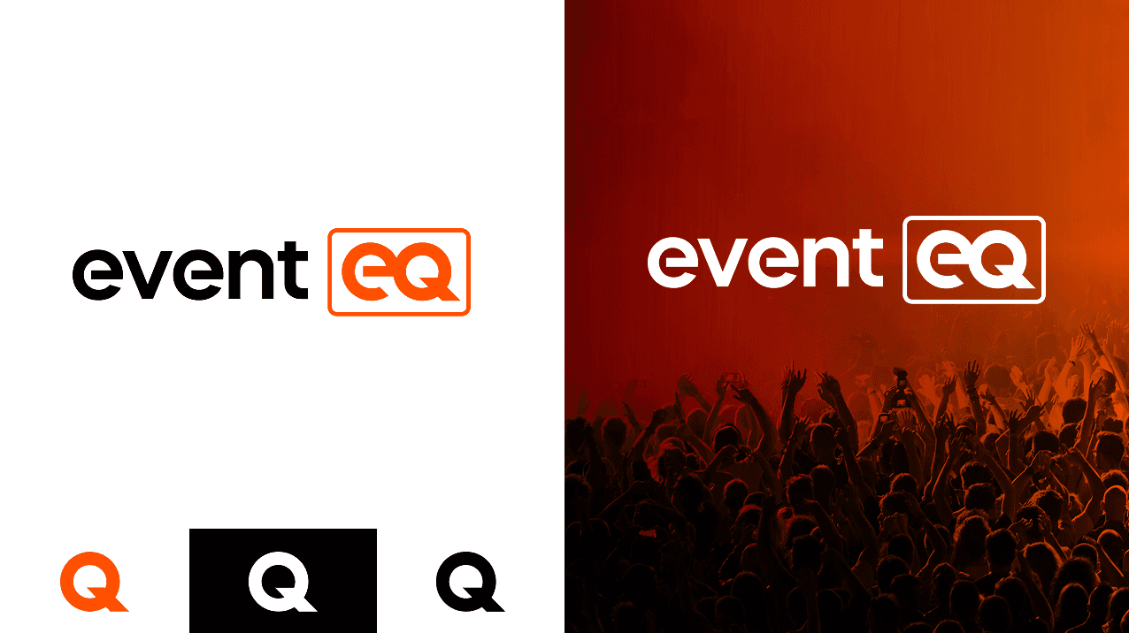
I led the EventEQ rebrand during the integration of an acquired live events brand (ChoiceLIVE), using the transition as an opportunity to refine and modernize the identity. The existing color palette was preserved to maintain recognizability, while the logo was updated to feel softer and more approachable without losing the sharpness and integrity of the “eq”, a core brand element. A hidden lowercase “e” embedded within the “Q” subtly references the original EQ mark.
To evolve the system further, I introduced new brand rules that increased the use of white space, allowing black and orange to function as accents and improving contrast while avoiding visual heaviness. Subtle grid elements were added as background textures to reference EventEQ’s scenic and design-led approach, reinforcing a key differentiator within the AV space.
Through the use of Powerpoint, Indesign and Figma Slides, I created several client-facing sales decks for EventEQ that included a combination of imagery, iconography, and infographics.

Google Ads Overview page, designed in Figma.
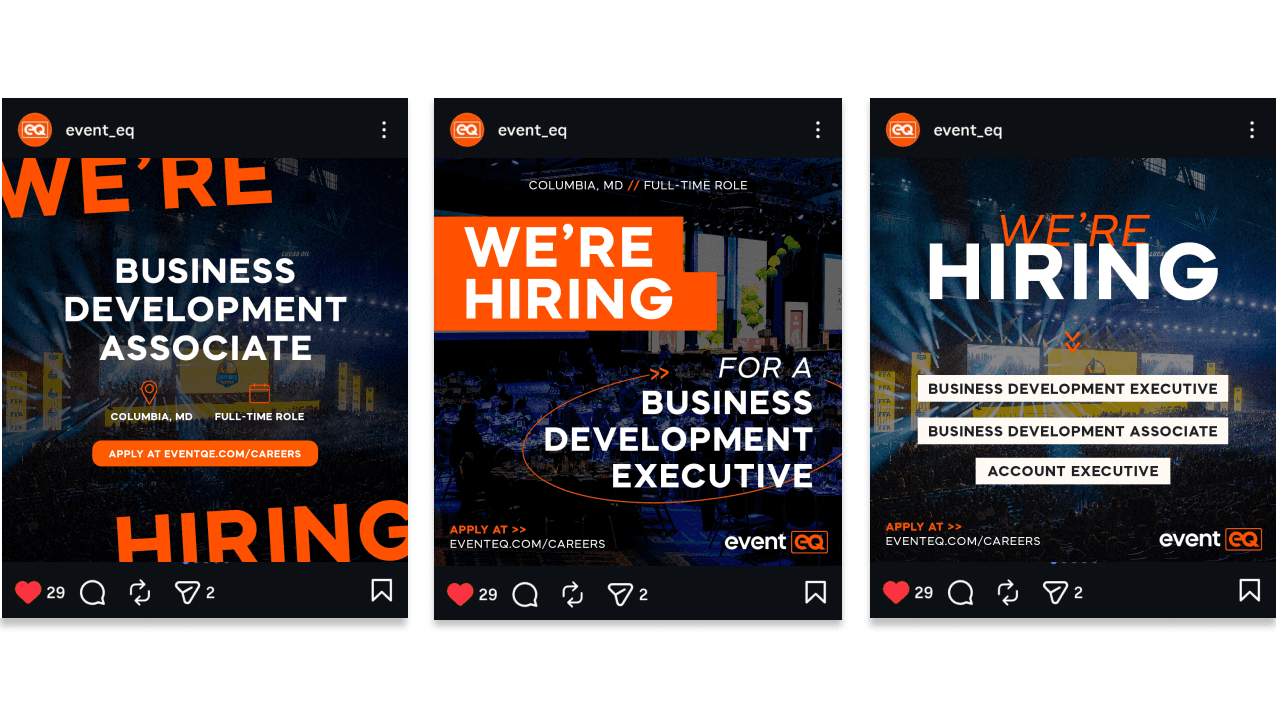
Social media and ad designs for hiring campaigns.