knw.

I developed the visual identity for knw from the ground up, defining how the brand looks, feels, and communicates visually within the ETP ecosystem. From there, I carried the identity through real-world applications including digital graphics, social media posts, one-sheeters and informational documents, presentations, and print and promotional materials, building a cohesive brand presence across both digital and physical touchpoints.

CLIENT

knw.

Role

Visual Identity, Proposal Material, Social Media & Informational Documents

CLIENT

knw.

Role

Visual Identity, Proposal Material, Social Media & Informational Documents

CLIENT

knw.

Role

Visual Identity, Proposal Material, Social Media & Informational Documents

Visual Identity

Visual Identity

Visual Identity

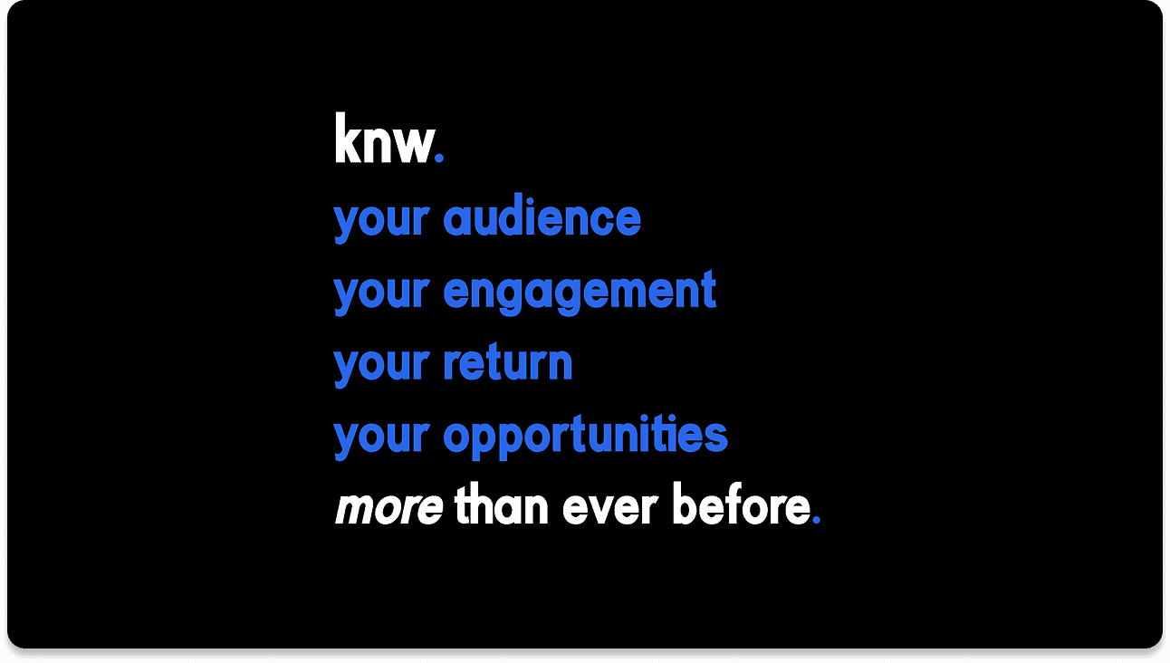
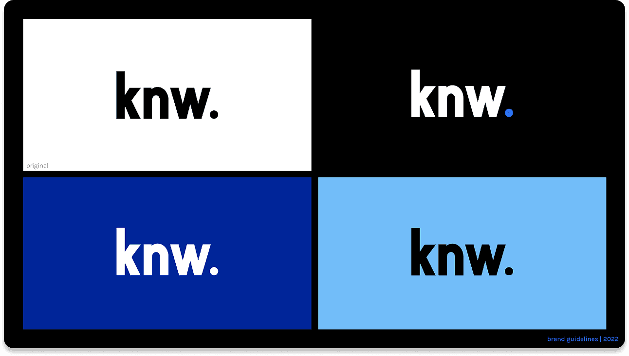
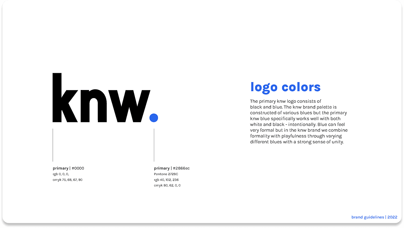
I developed the knw. brand guidelines while the platform itself was still in development, designing a flexible visual system that could grow alongside the technology. The geometric shapes and modular patterns were intentionally built to represent diverse data points, demographics, and statistics coming together into one cohesive and approachable platform. Lowercase typography and friendly type choices were selected to soften the typical tension surrounding facial recognition and data privacy, helping the brand feel more human and accessible.